Sunday, March 30, 2008

assignment 9


This Package displays a monochromatic color with the use of the Red.


This package uses an analogous color theory with the use of Yellow, Green, and Orange.


This package uses a Analogous color theory with the use of Green and Yellow.


This package uses a complementary color selection with the use of Green and Red.


This package uses an Analogous color theory by using Orange, Red and White.


This package uses a monochromatic color theory by using the red in the entire package.


This package uses a Triadic color with the colors Yellow and Blue.


This package uses a Double Complementary colors.  The Colors Yellow and Green and Blue are the main colors used.


This package uses a Complementary color theory with the Orange and blue.


This package uses a Split Complementary color theory with the red and blue


Assignment 8


My package design would have to be a mix of modern with a little contemporary.  I choose the Garmin Box and also a MacBook Pro Box.  Both have aspects that i really like.  The Garmin mixes a lot of different colors into the package and it is a simple Box, very easy to access and to open.  The MacBook Pro Box is a simple black and white mix to create a very professional look while displaying some gradient to add 3-D effect.  Both of these packages a really cool and fit well into my style off packaging.


Friday, March 14, 2008

Assignment 9

This package uses the monochromatic scheme.


Other than the brand name, this package uses the monochromatic scheme.


This package uses the complementary color scheme with the dark blue and yellow.


This package uses the analogous color combination as well as the complementary. The red and green colors are complementary, whereas the yellow, orange, and red together are analogous.


This package also uses the complementary color combination with the red and green.


This package uses the complementary color combination as well. The complementary colors are the dark blue and light orange.
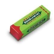


This package uses the triadic color combination with the red, green, and blue.


This package uses the double complementary color combination with the blue and yellow and the red and green.


This package uses the complementary color combination with the red and green.


This package uses the analogous color scheme with the red, orange, and yellow.

Wednesday, March 12, 2008

Fashion in packaging

If i had to choose i would pick contemporary. This mixture of fashions is best suited for my personality. I choose two packages that represent a contemporary design in my eyes which are the Lucky Charms box and Welchs 14oz individual use bottles. the Lucky Charms box has an array of color and fonts that jump out and grab your attention while at the same time the leprechaun in the middle has the "Gold". the gold in this case is the marshmallows in the cereal. This box also makes use of depth perception the rainbow is bigger on the right and shows it getting smaller on the left. The welchs bottles also make use of great color combinations that the soothes the brain. Also the unique shape of the bottle makes it flow with the idea of of freshness in a bottle.


Here is a link to the site: Link to StudioTwentySix2


Here is a link to the site: Link to
IDY

A8 - Packaging Fashion

If i had to chose i would probably say that my packaging fashion style would be modern, i just like the new and improved kind of look. Most modern packaging have a sleek, furturistic look to it, with the look of metal and certain color schemes. The first package i chose is a body spray by right guard. It has a very aluminum rustic look and definitely would appeal to a guy that would like to have a "tough guy" image that this product may protray. The second package i chose was the iPod package from Apple. I like alot of Apple's packaging strictly because its simple yet modern looking. They went with a plain black and silver look on most of their packages with a pictures of the product. Another feature i like about Apple's packages is the way they go together. The iPod sits inside of a slot cut out for it and then slides into a sleeve made to fit around the box. I like this style of packaging a lot, i think this would count as modern.


Source


Source


Tuesday, March 11, 2008

Assignment 8

I'm not really sure if I have my own packaging style, but I found these two packages to be pretty interesting. The first one looks like a package for a sun dial, and the second one looks like it might be honey or something (I'm not really sure what it is). I think this one would fall under the modern packaging style, whereas the second one could fall under contemporary style. The first one has a bright green color and square edges. The second has a smooth and straight profile. The first package is a little bit more complicated because of the top that flips up, whereas the second package is very simple.


Source


Source