Saturday, April 5, 2008

Packaging Fashion


This package is designed to protect the product while its being shipped to you, while you have the product and need to travel with it, and for when you finally decide to sell it to get something new. I like it because its protective and the case itself looks really cool

This package to me just stands out. I like it because its very subtle, yet its bright where it needs to be so you actually know what the product is.

ICPF Conference

The ICPF conference wasn't anything spectacular in my opinion. I had to attend last years conference also and the only difference was we actually got to ask questions. I think it could be set up a lot better, so much time is wasted when they go through the roll call at the beginning. I also don't agree with the contest results. How in the world is an oversized corrugated football a collectable? I thought it was bulky and unattractive, but I'm just a college student/ consumer who wouldn't buy it, so i don't think my opinion matters much.

Sunday, March 30, 2008

assignment 9


This Package displays a monochromatic color with the use of the Red.


This package uses an analogous color theory with the use of Yellow, Green, and Orange.


This package uses a Analogous color theory with the use of Green and Yellow.


This package uses a complementary color selection with the use of Green and Red.


This package uses an Analogous color theory by using Orange, Red and White.


This package uses a monochromatic color theory by using the red in the entire package.


This package uses a Triadic color with the colors Yellow and Blue.


This package uses a Double Complementary colors.  The Colors Yellow and Green and Blue are the main colors used.


This package uses a Complementary color theory with the Orange and blue.


This package uses a Split Complementary color theory with the red and blue


Assignment 8


My package design would have to be a mix of modern with a little contemporary.  I choose the Garmin Box and also a MacBook Pro Box.  Both have aspects that i really like.  The Garmin mixes a lot of different colors into the package and it is a simple Box, very easy to access and to open.  The MacBook Pro Box is a simple black and white mix to create a very professional look while displaying some gradient to add 3-D effect.  Both of these packages a really cool and fit well into my style off packaging.


Friday, March 14, 2008

Assignment 9

This package uses the monochromatic scheme.


Other than the brand name, this package uses the monochromatic scheme.


This package uses the complementary color scheme with the dark blue and yellow.


This package uses the analogous color combination as well as the complementary. The red and green colors are complementary, whereas the yellow, orange, and red together are analogous.


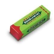
This package also uses the complementary color combination with the red and green.


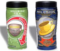
This package uses the complementary color combination as well. The complementary colors are the dark blue and light orange.


This package uses the triadic color combination with the red, green, and blue.


This package uses the double complementary color combination with the blue and yellow and the red and green.


This package uses the complementary color combination with the red and green.


This package uses the analogous color scheme with the red, orange, and yellow.

Wednesday, March 12, 2008

Fashion in packaging

If i had to choose i would pick contemporary. This mixture of fashions is best suited for my personality. I choose two packages that represent a contemporary design in my eyes which are the Lucky Charms box and Welchs 14oz individual use bottles. the Lucky Charms box has an array of color and fonts that jump out and grab your attention while at the same time the leprechaun in the middle has the "Gold". the gold in this case is the marshmallows in the cereal. This box also makes use of depth perception the rainbow is bigger on the right and shows it getting smaller on the left. The welchs bottles also make use of great color combinations that the soothes the brain. Also the unique shape of the bottle makes it flow with the idea of of freshness in a bottle.


Here is a link to the site: Link to StudioTwentySix2


Here is a link to the site: Link to
IDY

A8 - Packaging Fashion

If i had to chose i would probably say that my packaging fashion style would be modern, i just like the new and improved kind of look. Most modern packaging have a sleek, furturistic look to it, with the look of metal and certain color schemes. The first package i chose is a body spray by right guard. It has a very aluminum rustic look and definitely would appeal to a guy that would like to have a "tough guy" image that this product may protray. The second package i chose was the iPod package from Apple. I like alot of Apple's packaging strictly because its simple yet modern looking. They went with a plain black and silver look on most of their packages with a pictures of the product. Another feature i like about Apple's packages is the way they go together. The iPod sits inside of a slot cut out for it and then slides into a sleeve made to fit around the box. I like this style of packaging a lot, i think this would count as modern.


Source


Source


Tuesday, March 11, 2008

Assignment 8

I'm not really sure if I have my own packaging style, but I found these two packages to be pretty interesting. The first one looks like a package for a sun dial, and the second one looks like it might be honey or something (I'm not really sure what it is). I think this one would fall under the modern packaging style, whereas the second one could fall under contemporary style. The first one has a bright green color and square edges. The second has a smooth and straight profile. The first package is a little bit more complicated because of the top that flips up, whereas the second package is very simple.


Source


Source

Wednesday, February 27, 2008

Assignment 5- ICPF

This meeting seemed very cut and dry about sustainability as a whole. They talked about from the corrugated being made to the end product with it being printed. Throughout the process from virgin fibers to the inks used to print sustainability was the main goal. This seemed a but much but it drove the point home that packaging really is trying to do what is best for the environment. The part that seemed a bit pushed were the questions, if your going to ask these schools to participate at least have the six main packaging schools enough time to ask a question. i felt that it could have been done better in the sense that if they didn't give a big announcement for each school at the beginning that more time with each school could have been allotted for questions. I enjoyed the project section of the meeting with the four schools. However i feel that this competition was a bit rigged seeing how a corrugated football that is supposed to be "limited edition" (come on its corrugated) and it holds salsa and chips. This product however unique an idea would never hit the shelves at a grocery store. It is big, bulky, and looked like a torpedo more than a football. Overall the meeting hit home what packaging here at Clemson has been nailing home for the past 3 semesters now.

ICPF

The ICPF teleconference was a little different for me b/c i was presenting.  I was in and out of the room going over my presentation, and didn't really listen too much. But from what i saw it was a boring presentation by three different teachers who seemed to just say all the same thing.  I thought they should have done a little more interaction with the colleges.  The presentations at the end was enjoyable (partially b/c i was presenting) but more of those design type ideas would be a cool thing to discuss.

Assignment 5

ICPF Meeting


As I sit and reflect on the ICPF teleconference meeting negative thoughts come to mind. First off, the location of the meeting wasn’t very accommodating being that the temperature in the room was very warm. Secondly, the presentations that were given by the presenters didn’t catch my attention. My opinion is that the presenters didn’t try to connect with the audience whom they were presenting to. However, there was one incidence in which I got involved during the teleconference, when one of my fellow colleagues got up and presented an idea that he and his group designed for a contest. I feel that he did a great job creating his idea as well as describing it to the judging panel. If I was a judge I would have definitely chose his package over some of the higher winners, but he did a good job anyway despite his placing in the competition. I feel that his placement in this competiton was because the judging panel may have had some bias opinons.

If I could give this teleconference committee some advice, I would tell them to talk to their presenters, let them know that they should try to relate to their audience more. I realize that the information isn’t that exciting, but I feel that a better effort on the presenter’s part would help this teleconference out tremendously.

Assignment 5

The ICPF meeting was actually somewhat boring. A lot of it was stuff we have already heard a million times before. Of course the industry is concerned about sustainability and environmental impact. Almost everyone is concerned about that. The tips that the speakers gave about what to do in certain situations when you get on the job was helpful though.

As far as the competition went, it seemed like it was a little bit rigged. How did that giant ugly-looking "limited edition" corrugated football win 1st place. It didn't even look like a football, first of all, and can you imagine a grocery store trying to put 30 of those on a shelf? It would take up way too much space. Plus, if I eat chips and salsa out of something made of corrugated, I'm not going to put it over my mantle as a collectible. It seems like they just chose them as the winner because they are the partner school.

Response to ICPF Meeting

I thought the ICPF meeting was kind of a useless tool for learning. I dont think that it really related to what we have been learning until the last part when they were deciding the winners of the contests. For being the 11th annual teleconference they sure didnt seem to be on top of things in the technical department. Also, i thought that contest was rigged. The people that one i thought didnt really have a very good presentation and their product wasnt too original, i mean it was a good idea, but not very original. I got more out of the CapePak meeting than i did with the ICPF conference.

Sunday, February 24, 2008

Thursday, February 21, 2008

Wednesday, February 13, 2008

Assignment 3- Blogging on 3-D design

Three 3-D designs


I chose this new innovative laptop by Apple. This is the new Apple MacBook Air. I chose this because it is the thinnest notebook on the market at 0.8" thick. This laptop also weighs on 3 pounds. The laptop is so thin that you can place it in an envelope and have all the advantages of big and heavy laptops. This laptop gets the job done as fast as competitors laptops. The big advantage that I like about this design is the fact that it has a great push for travel and business.


This is the new Sony VAIO T5250. This innovative desktop computer eliminates the need for space. It is an all in one computer where what you see is what you have to have space for. There is no seperate tower, but a handy monitor and tower all in one. This is nice for people that have limited space like students in college that use desktops at there apartment or for someone who just doesn't want all the jumble of wires. The keyboard and mouse are both wireless, and the keyboard folds up to protect it from dust and to save space. The clear design around the edge gives the computer a modern feel and could fit into anybodies home

This is the new Nintendo Wii. This is the latest technology on the line at the moment for Nintendo. The sleek space saving design shows how much Nintendo wants to be part of the modern look and feel. This product also uses sensors for its controllers that allow person and game to become one. The use of this motion sensor allows gamers to incorporate the precise movements that they use to complete games. The white clean look also shows me that Nintendo wants to be seen as a pure and clean product. This Nintendo also allows old school gamers to download games like Duck Hunt and Super Mario. I like how Nintendo allows society to have access to all the new games and old games at the same time.

Here is a link to a Nintendo Wii http://www.walmart.com/catalog/product.do?product_id=5303671

3-D Designs


I choose this ice cream maker because of the cool new invention idea of downsizing the original package.  Its really cool and it makes ice cream faster and it also looks like a hamster ball.  There is a inner metal shell to keep the ice cream cold.  Sweet new way to make ice cream.


www.static.flickr.com/55/159749849_a63d51faa7_m.jpg

I choose this "Meet Bob" clock because i got one for christmas and it was really funny and random.  But its cool because of the way it changes settings, you just hit the side of "bob" and it will change to the temperature, timer, date, or clock.  A cool modern new design for a clock.


www.junkfoodblog.com/2005/12/altoids-mango-sours.html

I choose this Altoids can because of the cool "little" things it has to offer.  You can push the bottom of the can down and it lifts the opposite end up. A really cool feature.  Also i like the can because after you are done using all of the product you can still use the can for lots of uses.  Its a handy product to put in a car or purse for some quick candy

Monday, February 11, 2008

Assignment 3 - 3D Design


This is a pretty interesting design. It appears to be fairly simple and looks pretty much like a coffee thermos, but it is actually a self-heating package. This is pretty cool for people who are in a hurry and don't want to wait to brew their coffee. I personally don't drink coffee, but I imagine a package like this doesn't help with the "quality" image. Nevertheless, it is still a pretty interesting concept.

Source


This is a package for curry. It looks sort of like an apple sauce package put in a tray. The primary package has two compartments with one lid that is sealed across both of them. The tray that it sits in has a lot of bright colors. The tray really seems kind of unnecessary. I think you could get away with just the primary package and some graphics on the lid. I guess the tray makes the product look a little bit better and attracts more customers.


I thought this package was absolutely ridiculous. I guess this is more of a novelty item than something that is meant to be consumed. I can't imagine the amount of engineering that went into designing the bride and groom metal sleeves for the bottle so that they could actual run on a packaging line. I would have to imagine that these probably aren't put together by machine, and instead by hand. They're pretty interesting and definitely eye-catching though.

Source

Thursday, February 7, 2008

A3 - 3D Designs


This package is used for tea bags. The main purpose of this package is to squeeze the tea bag so you can acquire all of the flavor from the tea leaves inside. You could also carry dry teabags inside for future used during the day.


http://www.productdesignworld.com/


This package is used for delivering mail, more specifically to deliver hazardous diagnostic specimens. It is a tamper evident, rugged traceable, small consignment pack that is a very clever design.


http://www.productdesignworld.com/


This package is a very unique CD holder made for Microsoft Vista. I like this design the best because not only does it protect the CD and keep it off of the table or ground or whatnot, but it also makes the CD easily visible so you can tell right away what the CD is for.

http://www.flickr.com/photos/rs3art/303983813/in/set-72157594393542938/